Websites serve as the storefronts of businesses, non-profits, artists, and virtually anyone seeking to establish an online presence. With the diverse range of devices people use to access the internet, it becomes imperative to create websites that are universally compatible and user-friendly. Enter the realm of responsive website design and development, a design approach that adjusts a site’s layout to the user’s screen size and device. This article delves deep into the essence, benefits, and SEO advantages of responsive website design.
What is Responsive Website Design?
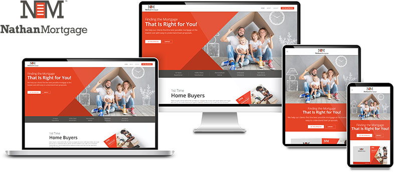
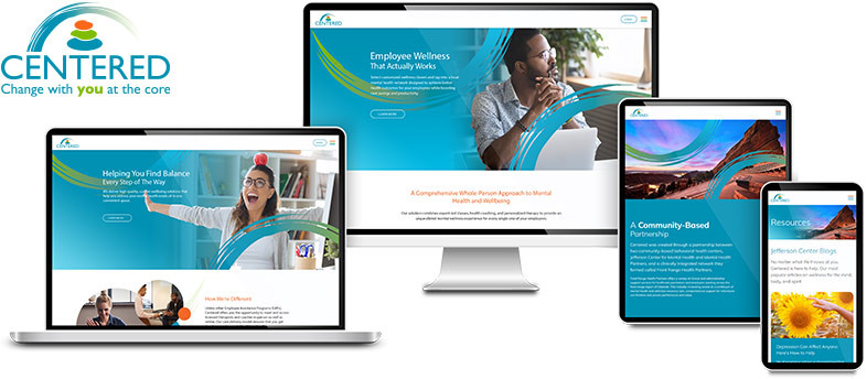
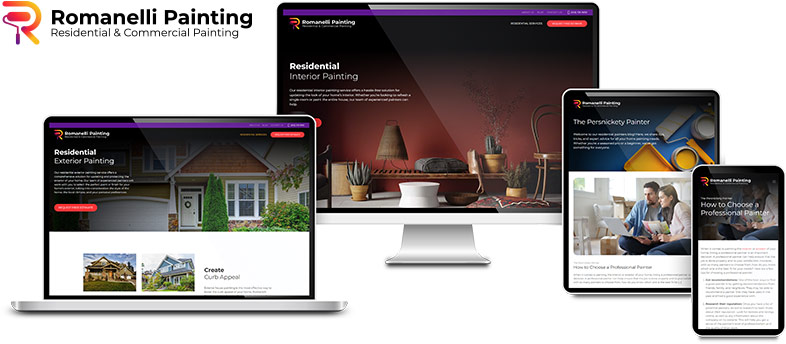
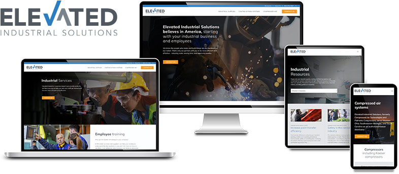
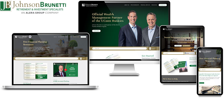
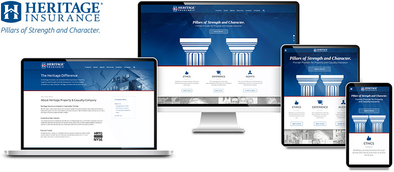
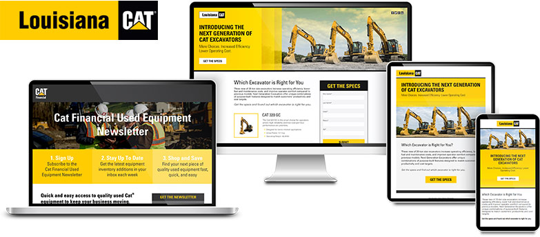
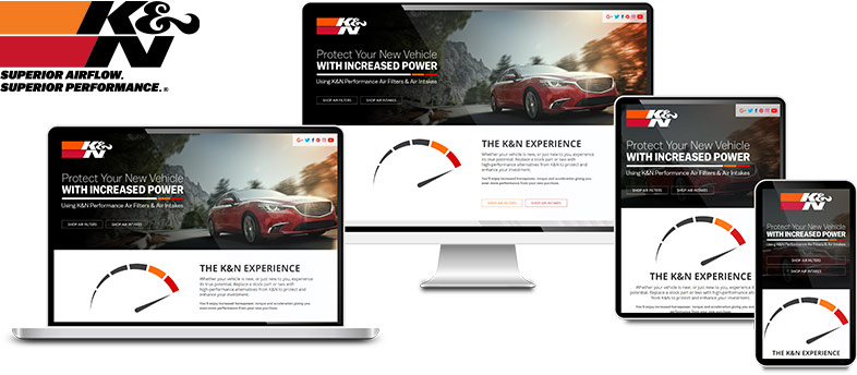
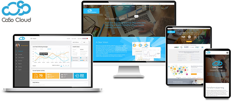
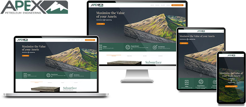
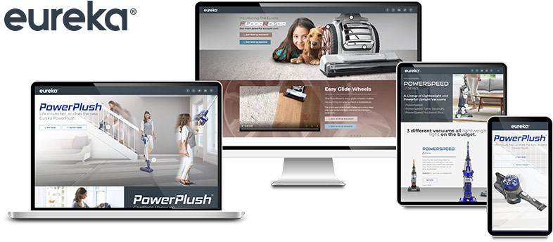
Responsive website design (RWD) refers to the approach where a website is crafted to provide an optimal viewing experience across a wide range of devices. Whether a visitor accesses a site from a large desktop monitor, a tablet, or a small smartphone screen, RWD ensures that the website displays correctly and is easy to navigate.
Key features include:
- Fluid grids: Elements are sized in relative units like percentages, rather than absolute units like pixels.
- Flexible images: Images are set to automatically scale within their containing elements.
- Media queries: CSS techniques that apply styles based on the device’s general type, such as its display type, width, height, or orientation.
Benefits of Responsive Website Design for User Experience
- Consistency: Users experience a consistent look and feel regardless of the device they’re using, which leads to better user satisfaction and brand recognition.
- Increased Engagement: With a user-friendly design, visitors are more likely to stay longer and engage with the content.
- Lower Bounce Rates: Users are less likely to leave a site out of frustration due to poor design or navigability issues.
- Cost-effective: Instead of developing separate sites for different devices, businesses can maintain one single site, saving both time and money.
Benefits of Responsive Design for SEO
Search engines, especially Google, have continually emphasized the importance of mobile-friendliness in their ranking factors. Here’s why responsive design is good for SEO:
- Mobile-first indexing: Google predominantly uses the mobile version of content for indexing and ranking. A responsive design ensures that your site is ready for this.
- Reduced Duplicate Content: Instead of creating multiple versions of your website for different devices, there’s just one URL and one set of pages and content, which avoids potential SEO issues related to duplicate content.
- Improved Site Usability: Good user experience can lead to longer time on site and lower bounce rates, which can indirectly influence ranking position.
- Faster Page Load Times: Responsive designs often lead to faster load times, especially on mobile. Google considers page speed as a ranking factor.
Common Questions about Responsive Website Design
How does a responsive design work?
A responsive website dynamically adjusts its layout and elements based on the device’s screen size and orientation. It utilizes a combination of fluid grids, flexible images, and media queries.
Why is responsive design important?
In an era where mobile devices dominate internet usage, ensuring your site looks good and functions well on any device is critical for user experience and SEO.
How can I check if my website is responsive?
Tools like Google’s Mobile-Friendly Test or manually resizing your browser window can help assess responsiveness.
What are some popular responsive frameworks, and how do UIKit and Bootstrap fit into the landscape?
Responsive frameworks are essential toolkits that assist developers in creating mobile-friendly and adaptable web designs efficiently. Two of the most renowned responsive frameworks are UIKit and Bootstrap.
UIKit is a lightweight and modular front-end framework that offers a comprehensive collection of HTML, CSS, and JS components. It stands out for its clean, intuitive, and advanced UI components, making it ideal for modern web and app design. https://getuikit.com
Bootstrap, on the other hand, is one of the most widely adopted frameworks, known for its ease of use and extensive components. It provides a grid system, numerous pre-styled components, and JavaScript functions, simplifying the rapid development of responsive websites. https://getbootstrap.com
Both frameworks serve the purpose of accelerating the development process and ensuring consistency across different devices, but the choice between them often boils down to the specific requirements of the project and the developer’s familiarity with the framework.
Other popular responsive CSS frameworks include:
- UIKit – https://getuikit.com
- Foundation – https://get.foundation
- Skeleton – http://getskeleton.com
- Bulma – https://bulma.io
- Semantic UI – https://semantic-ui.com
- Materialize – https://materializecss.com
Conclusion
The advantages of responsive website design are many. It not only enhances the user experience across multiple devices but also boosts SEO performance. In today’s multi-device world, having a responsive website is no longer just a good practice – it’s a necessity.
Harnessing the power of responsive design ensures that businesses and individuals remain competitive in the evolving digital landscape. Whether you’re a developer or a business owner, it’s crucial to prioritize responsiveness in your website strategy.